A few months ago I wrote about implementing a debug panel in AngularJS. I’m just getting into React.js so I thought I would do the same by way of comparison. Maybe I’ve become a less complex person in the intervening months but I found the React implementation a lot simpler. It just kind of fell out.
The Problem
I want a panel that will display the current state of my react application that can be easily turned on and off.
The Demo Application
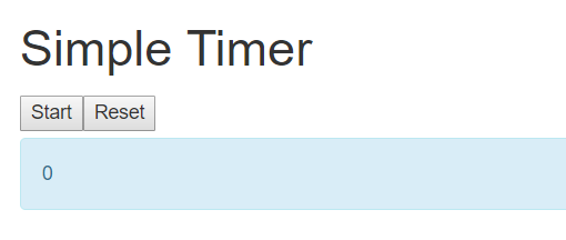
My demo application is a timer application. We can start, stop and reset the counter. It’s not the application that is going to kickstart my unicorn tech startup but it will serve for this purpose.
The react components of the simple timer are, well, simple.
- Application
- Header
- Button (Start/Stop)
- Button (Reset)
- Label (Output)
- Label (Debug Panel)
So the debug panel is just an instance of the my label component.
The Implementation
Label Component
This is a bootstrappy label that takes in a couple of properties. In it’s simplest form the render method is
 render(){
   return <div className="row">
            <div className="col-lg-12">
              <div className="alert alert-info">{this.props.label}</div>
            </div>
          </div>;
 }
So it returns some JSX that can take a prop value that sets the label text. We build it from a parent component like this…
<Label label=”My First Label” />
Adding a bit more complexity we can toggle the visibility which is one of our requirements for a debug panel. So adding this in and taking the opportunity to show the entire label component
class Label extends React.Component{

  constructor(props) {
    super(props);
    this.props = props;
  }

  render(){

    if(this.props.visible != "false"){

      return <div className="row">
               <div className="col-lg-12">
                 <div className="alert alert-info">{this.props.label}</div>
               </div>
            </div>;
    }
    else{
      return null;
    }
  }
};
So now it has a property ‘visible’ that can show and hide the label which we call thus
<Label label=”My First Label” visible=”true” />
The Debug Label
The debug label is just a variant on how this label is constructed. I’m holding my state at the application level – I don’t want it scattered around my lovely simple timer willy nilly. The component is the same and it is constructed from the application component like this…
<Label label={JSON.stringify(this.state)} visible="true" />
with the state parsed to a string and passed in. It renders like this
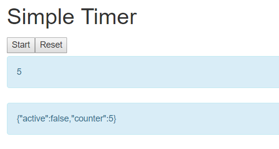
So I can easily see the state of the application. It can be turned off easily with the visible prop
<Label label=”My First Label” visible=”false” />
Though to toggle on and off does require a rebuild (with gulp in this case). I don’t think this is a significant hardship.
Further Thoughts
I am aware that I’ve basically implemented a very simple version of the chrome developer toolbar but I still like it. I like to see the state up front and it’s a simple little thing that shouldn’t cause anyone any problems or upset.
I could enhance it a bit – changing the colour of the debug panel or doing the stringify in a dedicated debug panel which consumes the standard label. But once it was done I was happy and didn’t want to tinker. It was also notably simpler than the Angular implementation but I feel react itself is a simpler proposition and living in simpler times is no bad thing.
Useful Links
As ever the source code can be found at my github site
https://github.com/timbrownls20/Demo/tree/master/React/SimpleTimer
The styles are generously provided by bootstrap. Documentation can be found here
https://getbootstrap.com/docs/4.0/getting-started/introduction/
React homepage from the Facebook mothership
https://facebook.github.io/react/


