The Task
I want the modal dialog component working in a React project. My React project uses function components and hooks but it would be the same with class components.

The Problem
To show the modal I need to call it thus
$('#myModal').modal('show')
It’s not going to work as is in React. There is no JQuery and I don’t want to be referencing DOM elements directly if I can avoid it.
The Solution
I’m going to roll my own and use useState react hook to swap the classes in and out to show and hide it.
Justification
I could import JQuery and use a useRef hook to the DOM. But I don’t want to install JQuery into my project just so I can have a modal dialog behaving appropriately. It should be possible without it.
Alternatively I could use React-Bootstrap components. But it feels a bit abstracted to me. In any case I just want the modal working not a heap of other bootstrap components. Also, I want to use the latest bootstrap and not be forced to use the earlier one in React-Bootstrap.
So I’m going to roll my own. No true programmer would save time by using third party components or by taking shortcuts. They do it themselves and take much longer about it. I shall do it this way **
** I use third party components and shortcuts all the time. I’m just not going to for this one.
Implementation
Full implementation is on my git hub site
https://github.com/timbrownls20/Demo/tree/master/React/bootstrap-modal
so I recommend that you go straight there and copy the code down. It’s stripped down to basics and it’s pretty straight forward
Modal Component
https://github.com/timbrownls20/Demo/blob/master/React/bootstrap-modal/src/components/Modal.jsx
import React from 'react';
const Modal = ({ children, show, hideModal }) => (
<div
className={`modal ${show ? ' modal-show' : ''}`}
tabIndex="-1"
role="dialog"
>
<div className="modal-dialog" role="document">
<div className="modal-content">
<div className="modal-header">
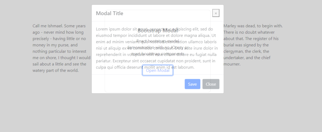
<h5 className="modal-title">Modal Title</h5>
<button
type="button"
className="close"
data-dismiss="modal"
aria-label="Close"
onClick={hideModal}
>
<span aria-hidden="true">×</span>
</button>
</div>
<div className="modal-body">
{children}
</div>
<div className="modal-footer">
<button type="button" className="btn btn-primary" onClick={hideModal}>
Save
</button>
<button
type="button"
className="btn btn-secondary"
data-dismiss="modal"
onClick={hideModal}
>
Close
</button>
</div>
</div>
</div>
</div>
);
export default Modal;
It’s a straight copy from the bootstrap documentation with a prop to toggle the visibility and a function to response to close and save.
State
https://github.com/timbrownls20/Demo/blob/master/React/bootstrap-modal/src/components/App.jsx
import React, { useState } from "react";
import Modal from "./Modal";
import ModalLauncher from "./ModalLauncher";
import '../css/modal.css';

function App() {
  const [show, setShow] = useState(false);

  const showModal = () => {
    setShow(true);
  };

  const hideModal = () => {
    setShow(false);
  };

  return (
    <div>
      <div className="container-fluid">
      <div className="d-flex justify-content-center align-content-center m-5">
            <div className="p-5 demo-text">front page text</div>
            <ModalLauncher showModal={showModal} />
            <div className="p-5 demo-text">More front page text</div>
        </div>
        <Modal show={show} hideModal={hideModal}>Modal content</Modal>
      </div>
    </div>
  );
}

export default App;
The show and hide state is set at the parent component level and is persisted through a state hook taking a boolean i.e.
const [show, setShow] = useState(false);
CSS
The detail of it is really in the CSS and it’s that I had t spend time fiddling around with
https://github.com/timbrownls20/Demo/blob/master/React/bootstrap-modal/src/css/modal.css
.modal{
    display: block;
    visibility: hidden;
}

.modal-show
{
    visibility:visible;
    background-color: rgba(169, 169, 169, 0.8);
    transition: opacity 0.2s linear;
}

.modal-content
{
    opacity: 0;
}

.modal-show .modal-content
{
    opacity: 1;
    transition: 0.2s linear;
}
To get the modal to appear and disappear is straight forward but I want it to show with a transition to fade it in and out, otherwise it looks terrible. That’s a bit more awkward.
To do this, the modal styles are overridden. The visibility in bootstrap is controlled by the CSS display property. I’ve changed it to use the visibility property. If the showing and hiding is managed by changing display from none to block then the transitions don’t work. Visibility does work with transitions, hence the change
.modal-show is the class that we add and remove to show and hide the modal dialog. We use opacity to bring in the dialog. Interestingly if I use
.modal-show
{
    visibility:visible;
    background-color: rgba(169, 169, 169);
    opacity: 0.5;
    transition: opacity 0.2s linear;
}
Then the dialog and the background have an opacity of 0.8 and I’ve got a see through modal which I definitely don’t want.
Setting the opacity with background-colour just applies it to the background overlay and the dialog itself isn’t affected and is not see through at all.
The final wrinkle is that now the dialog doesn’t transition in, although the gray background overlay does. It actually looks OK to me (but then I’m not a designer so I don’t care hugely about this stuff). To get the dialog fading in and out it needs its own CSS transition, this time on opacity i.e.
.modal-content
{
    opacity: 0;
}

.modal-show .modal-content
{
    opacity: 1;
    transition: 0.2s linear;
}
Now the background overlay fades in to 0.8 opacity and the modal dialog fades in to opacity 1 i.e. fully visible.
I could spend more time playing around with the CSS to improve it further and believe me I’m tempted to do just that. However, I’ve got a paid job to do and a daughter who is insisting that I play Minecraft with her (which is what passes for parenting these days). So, I am declaring it job done!
Useful Links
This Stack overflow question gives a whole bunch of implementations for this but they do use JQuery which I wanted to avoid. It might well be the definition of madness to implement something that has already got a bunch of alternative implementations. I just wanted to do it without JQuery.
Bootstrap modal dialog documentation. The JQuery does more than open and close the dialog but that’s all I need it to do right now
React-Bootstrap components. I’ve tried these but I just don’t like them. I’ve watched pluralsight videos where people are very keen on them so it’s probably just me.
1 COMMENTS
LEAVE A RESPONSE


Been looking a long time for a way to do this!! All the articles I find utilize react-bootstrap and I really don’t want to add another library if I don’t have to. I was trying to use react-confirm-alert but my purpose, but that was not reflecting state updates and doesn’t appear to be getting updated recently. This was a huge help!
Thank you!